About
The Project
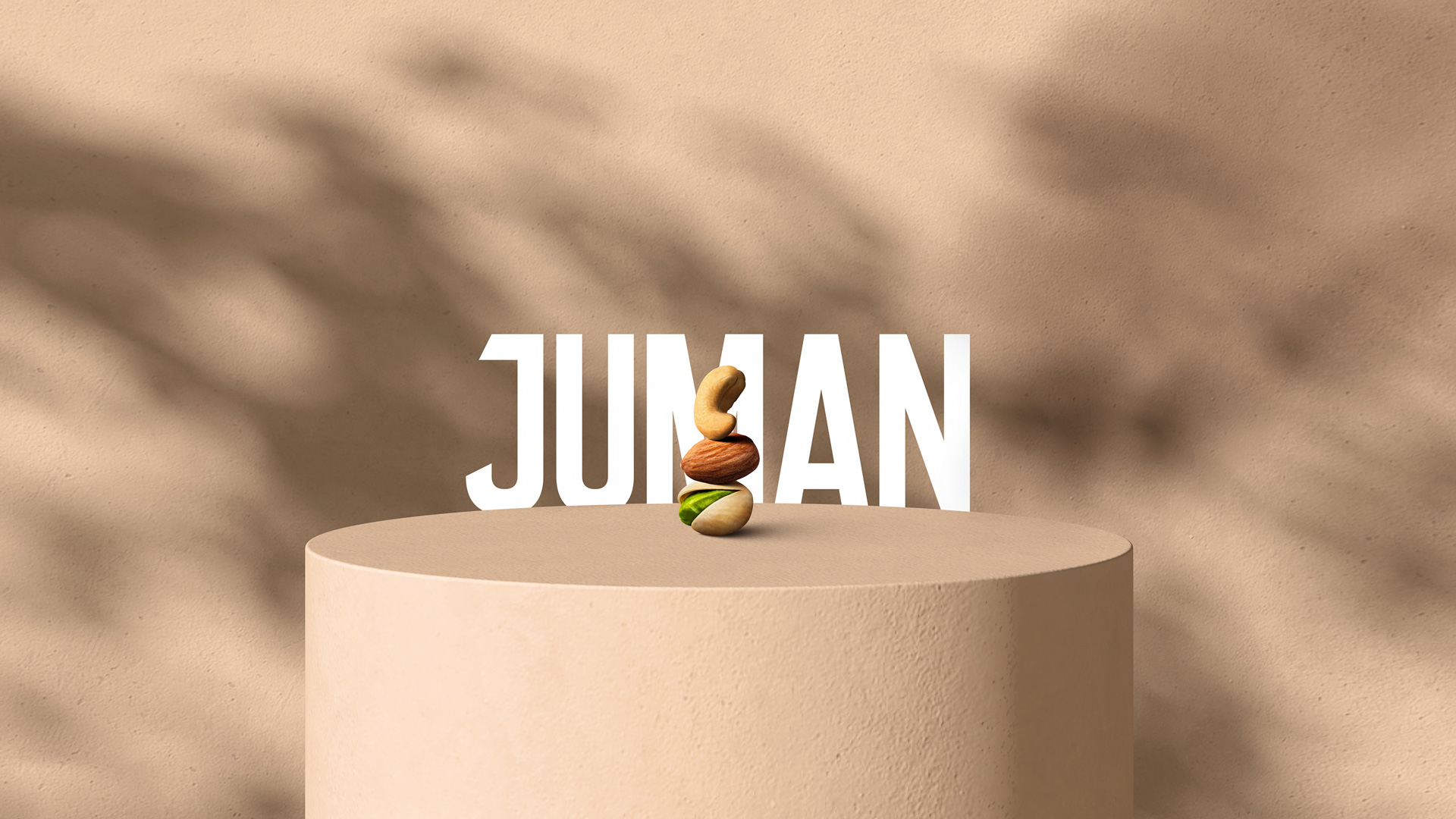
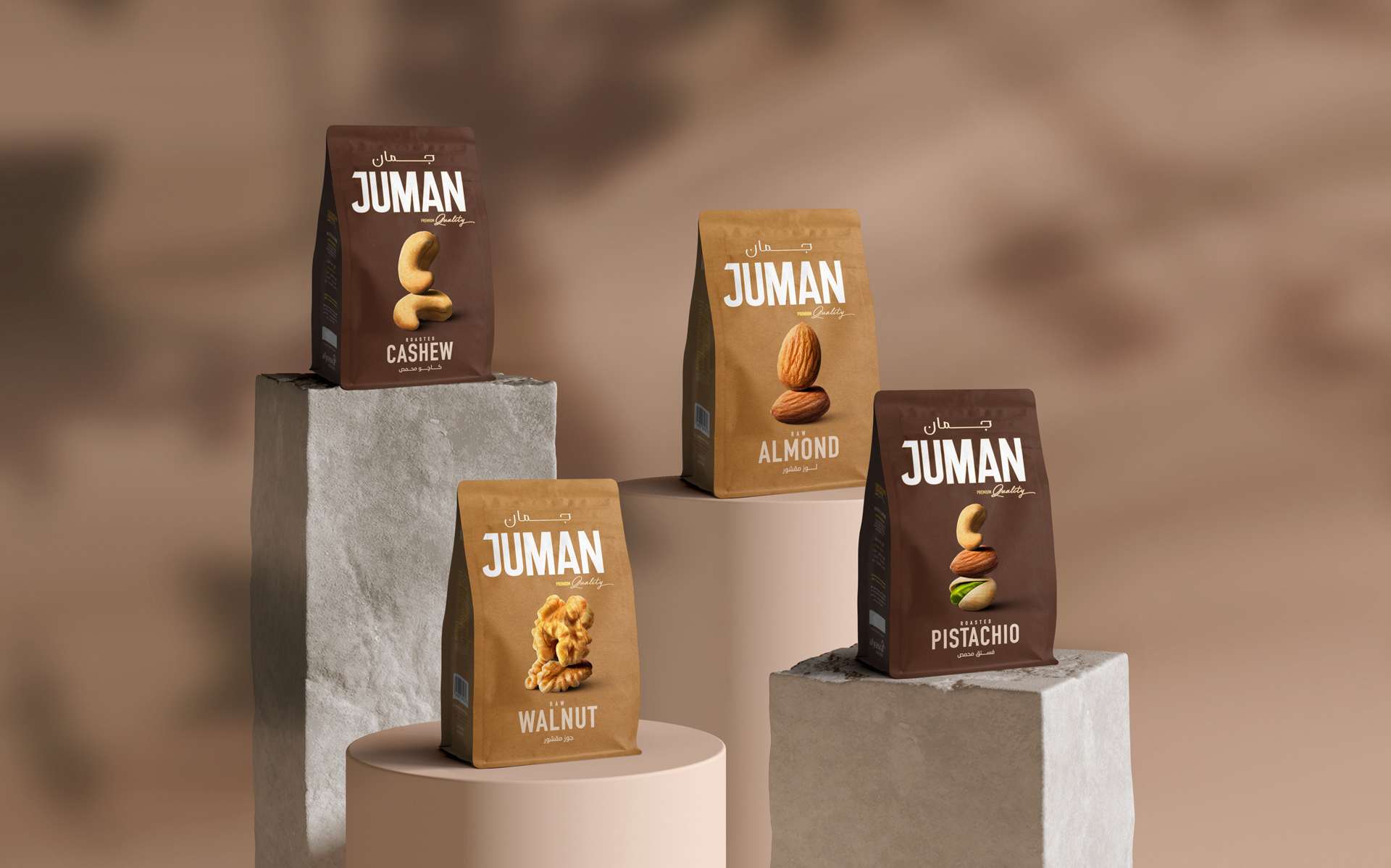
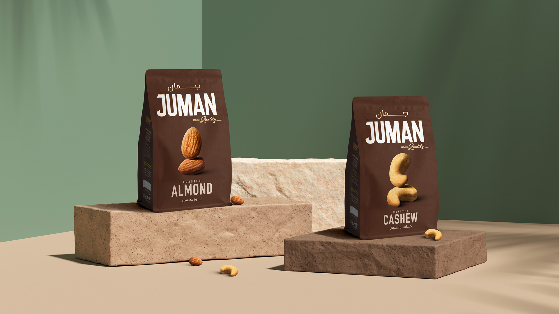
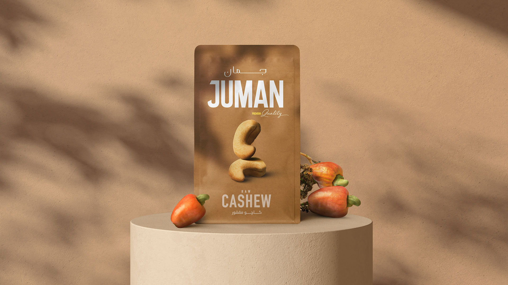
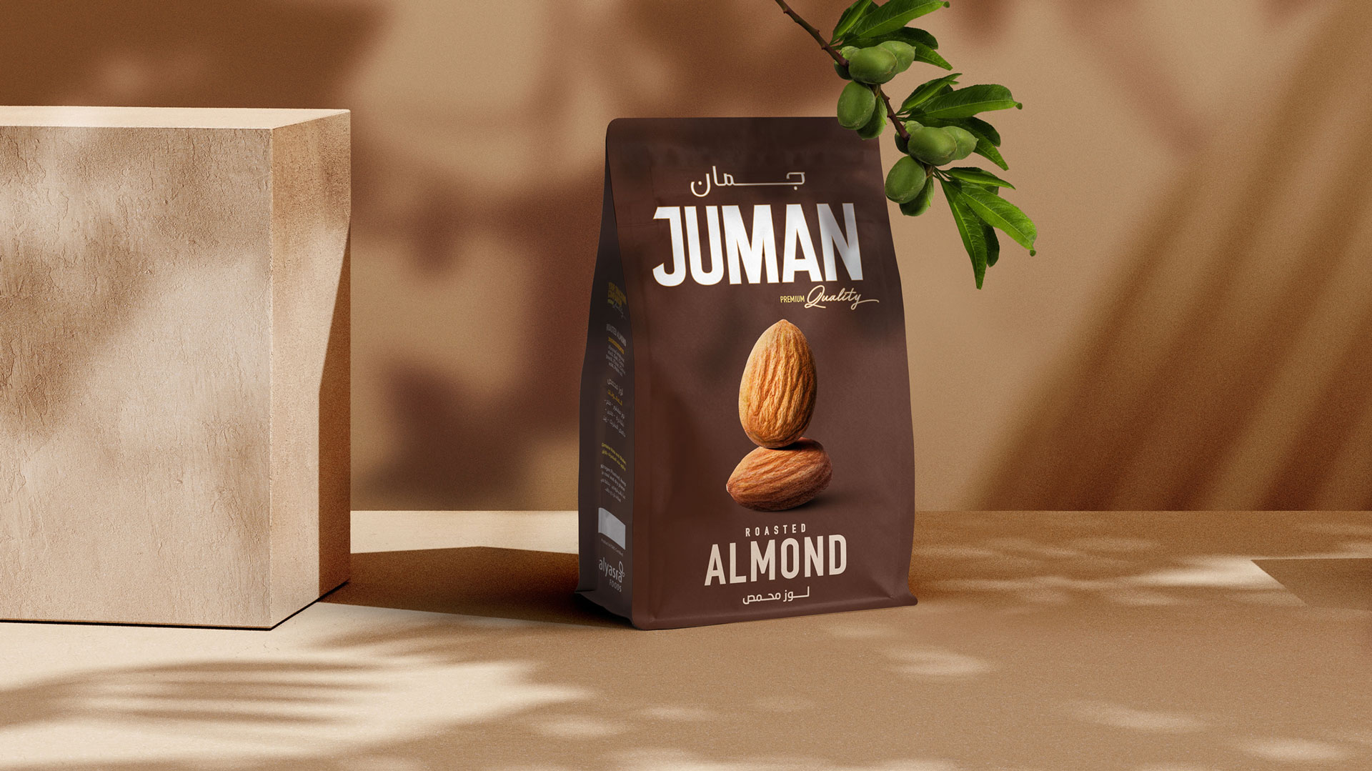
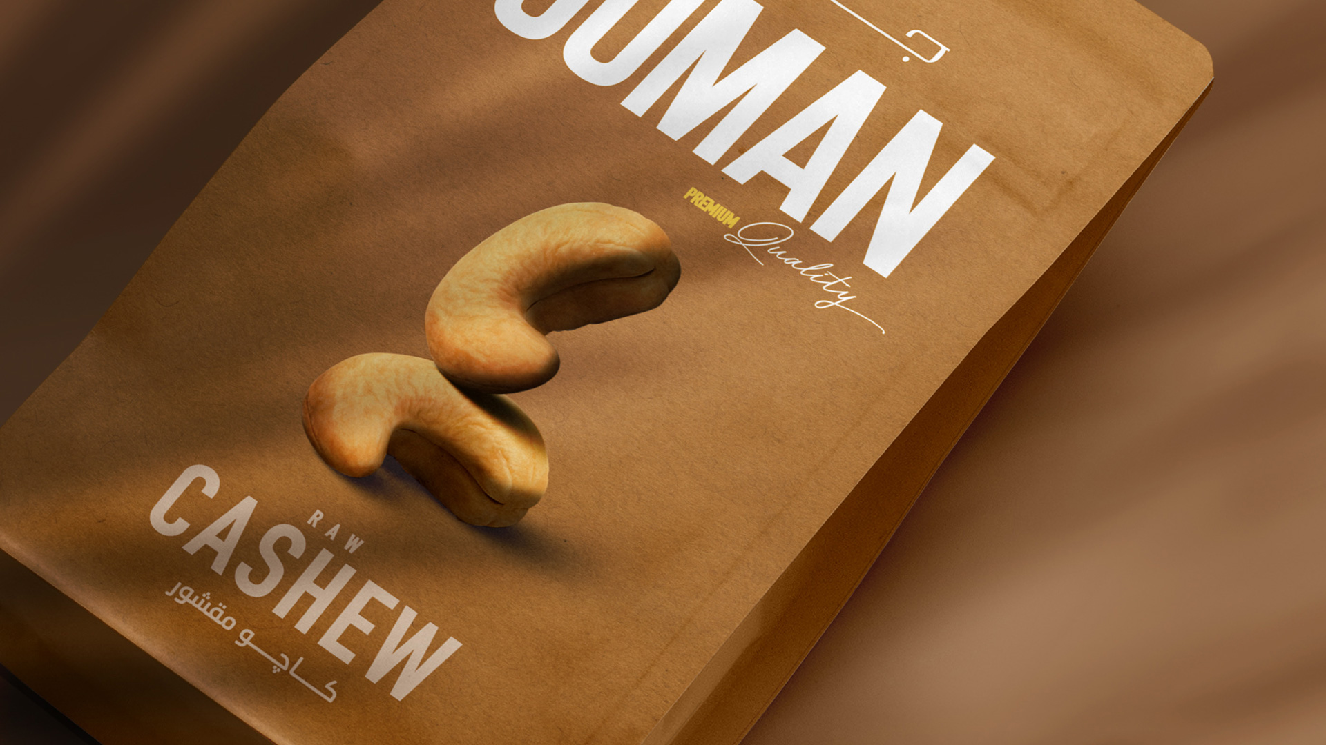
To complement Juman's refined nature, we created a simple and sophisticated packaging design that highlights the brand's premium yet grounded essence. Our use of both modern and classic typefaces gave the brand a distinct edge in the market, with a sophisticated touch that instantly elevated it. Tying the brand's identity together using a minimal visual language - we simply highlighted the nut on the packaging, setting it against a plain backdrop of shades of beige and brown. Our earthy color palette served to reflect the purity and quality of the nuts themselves.
Next Project