About
The Project
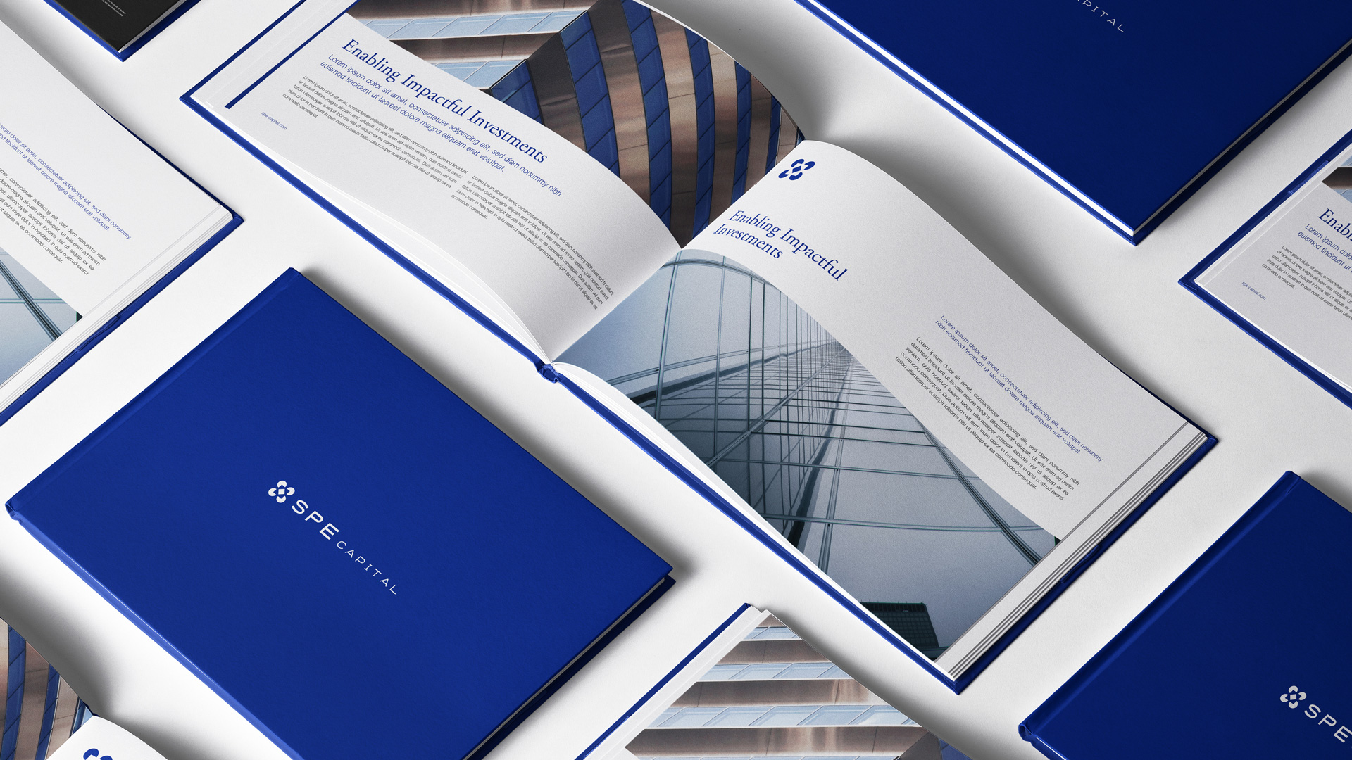
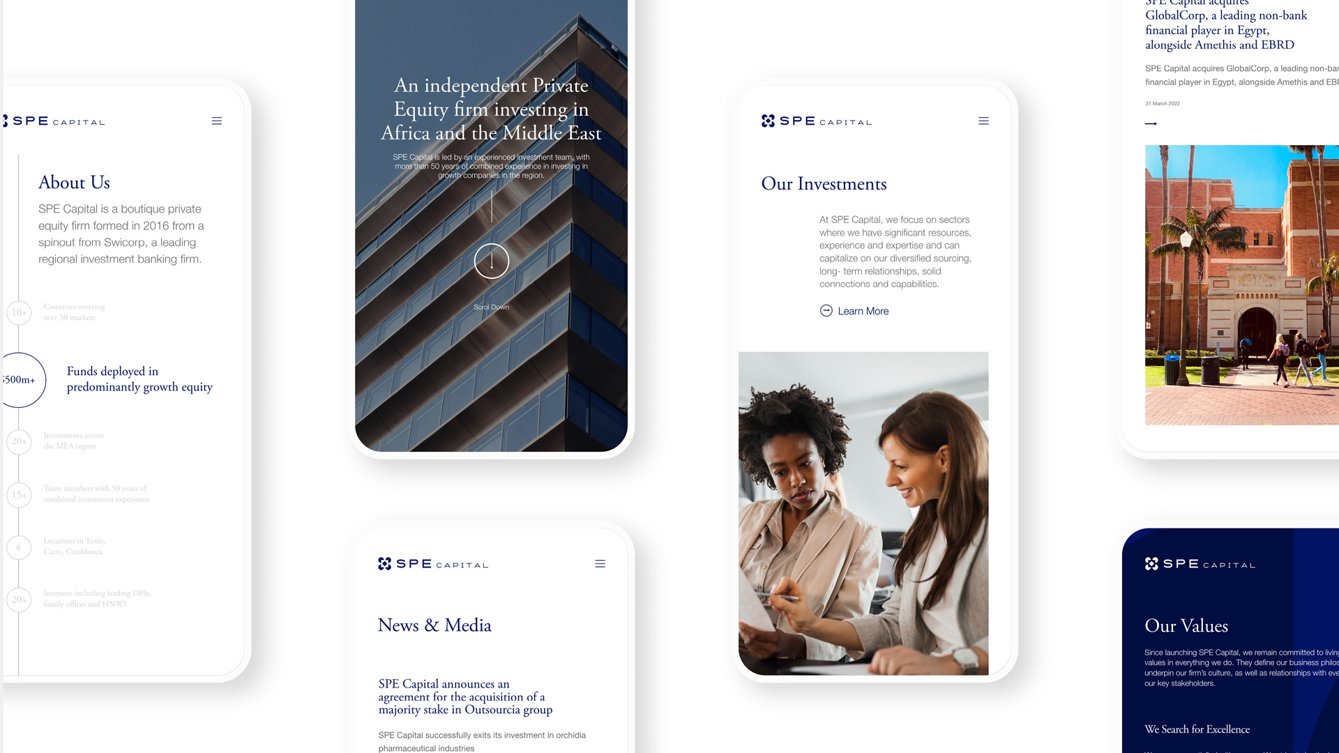
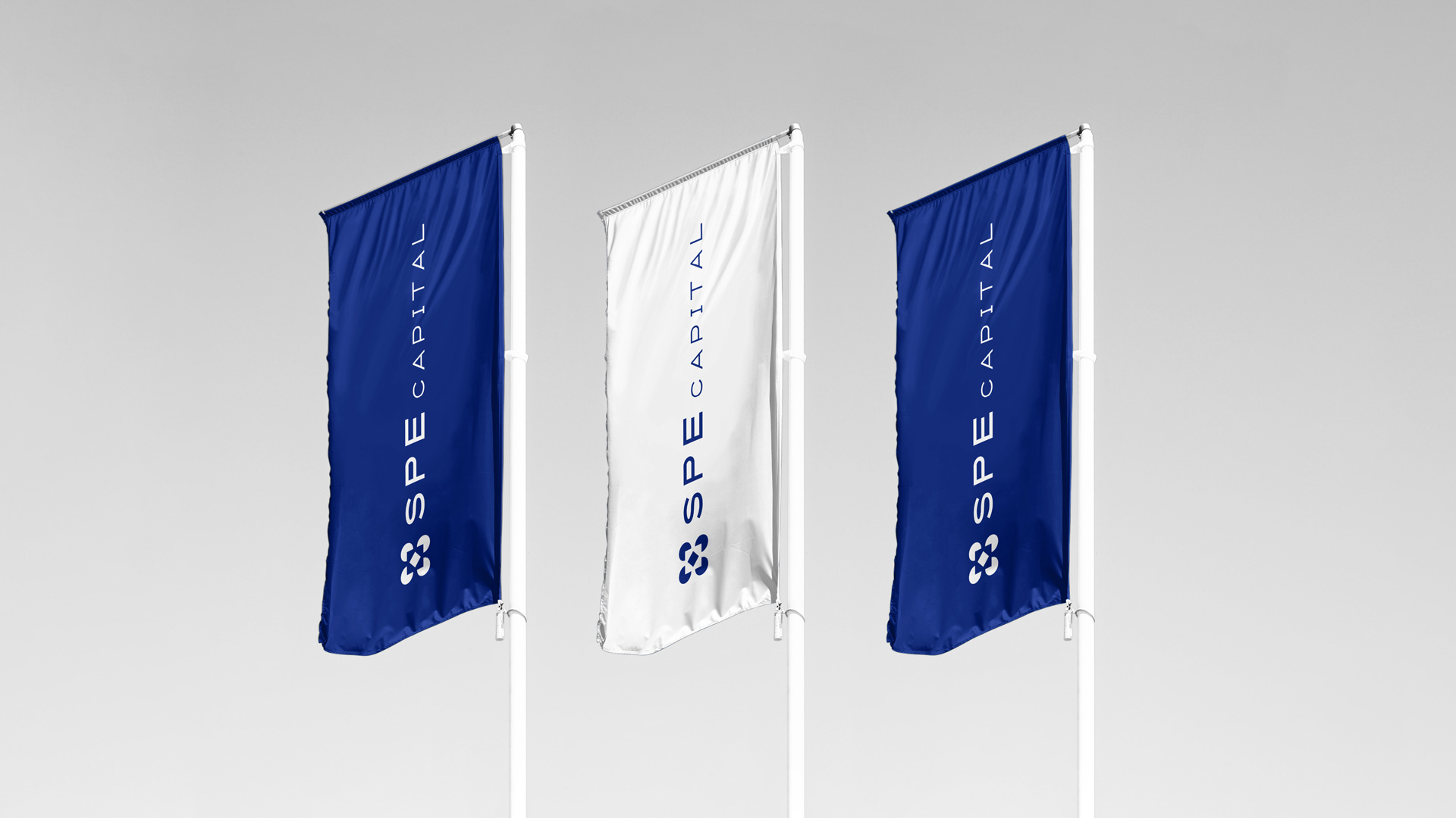
We created a new visual identity for SPE Capital designed to signal a new era of growth.
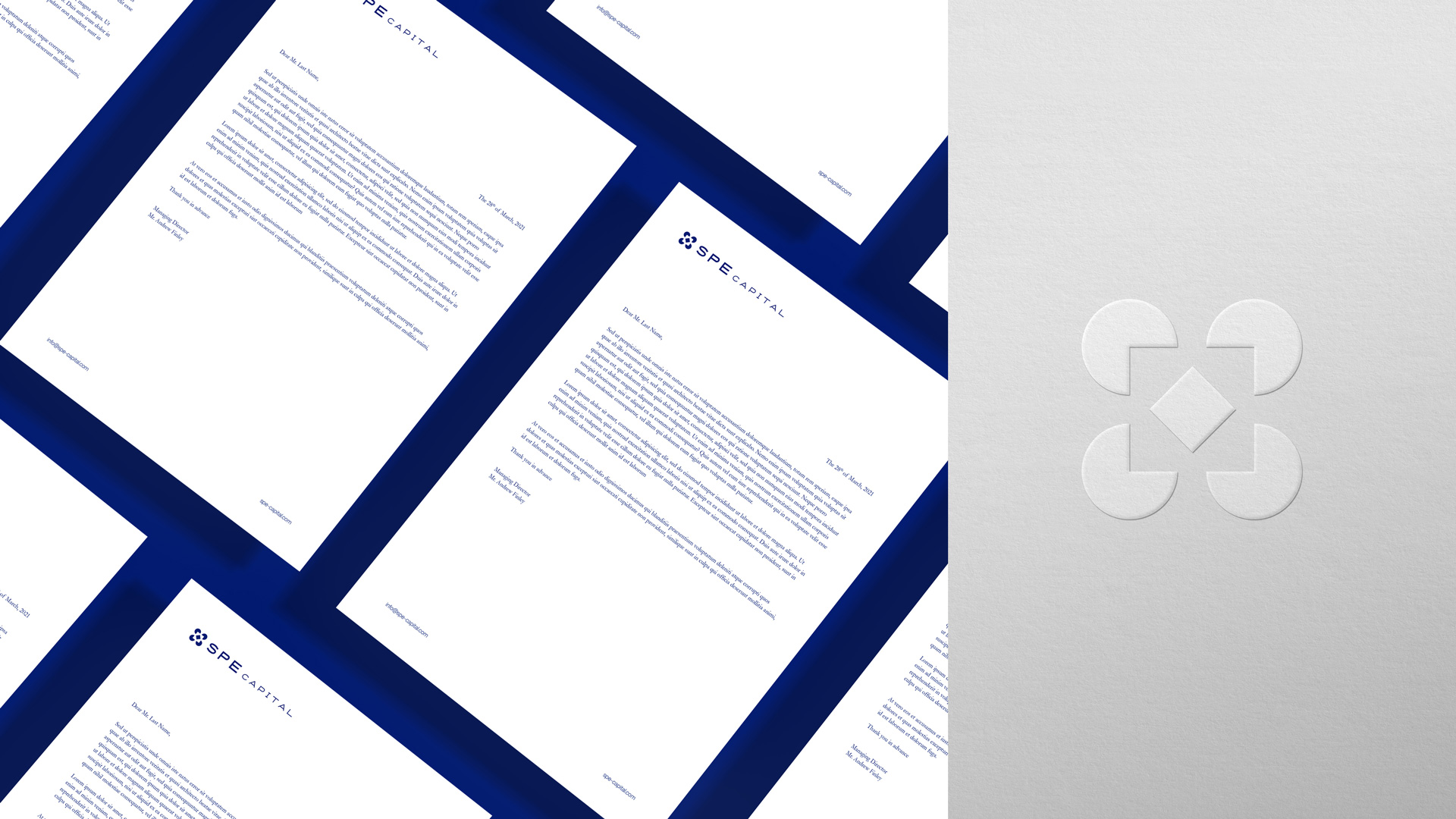
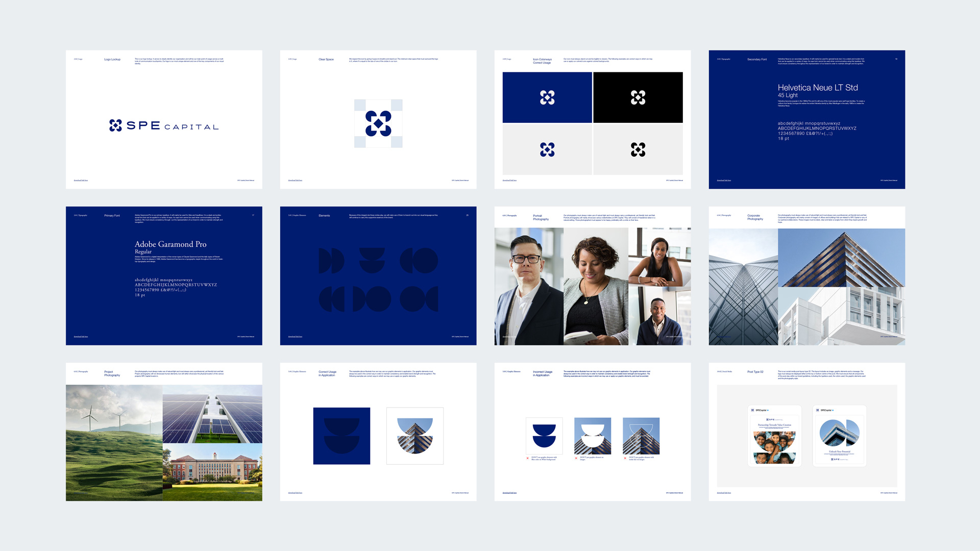
Every process initiated by SPE goes through multiple cycles, and these cycles always go full circle. Inspired by the circle as a symbol for SPE’s partners - our logo seamlessly reflects the essence of what the brand does by highlighting its collaborative nature, and its support in investment opportunities. At the core of this essence lies SPE’s goal to always ensure they are right in the middle of the action.
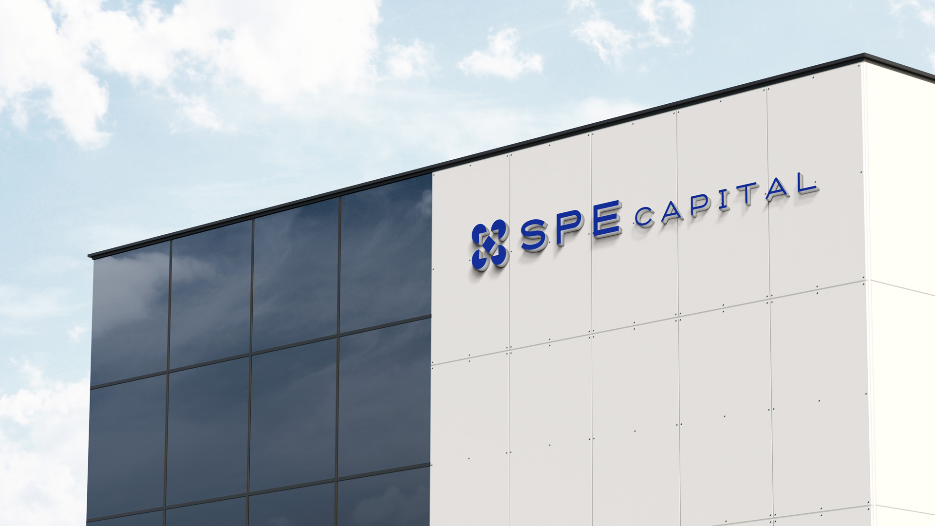
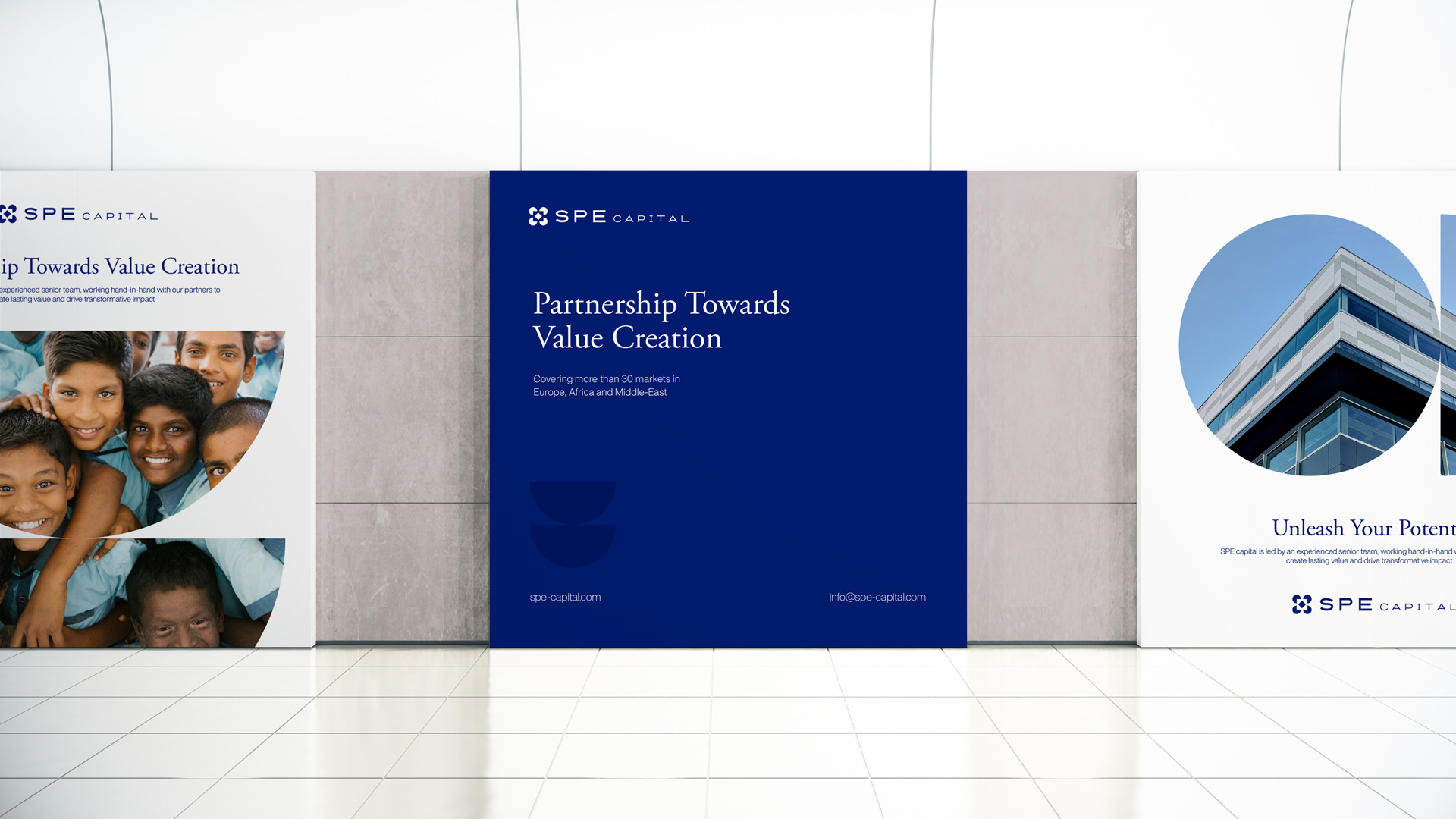
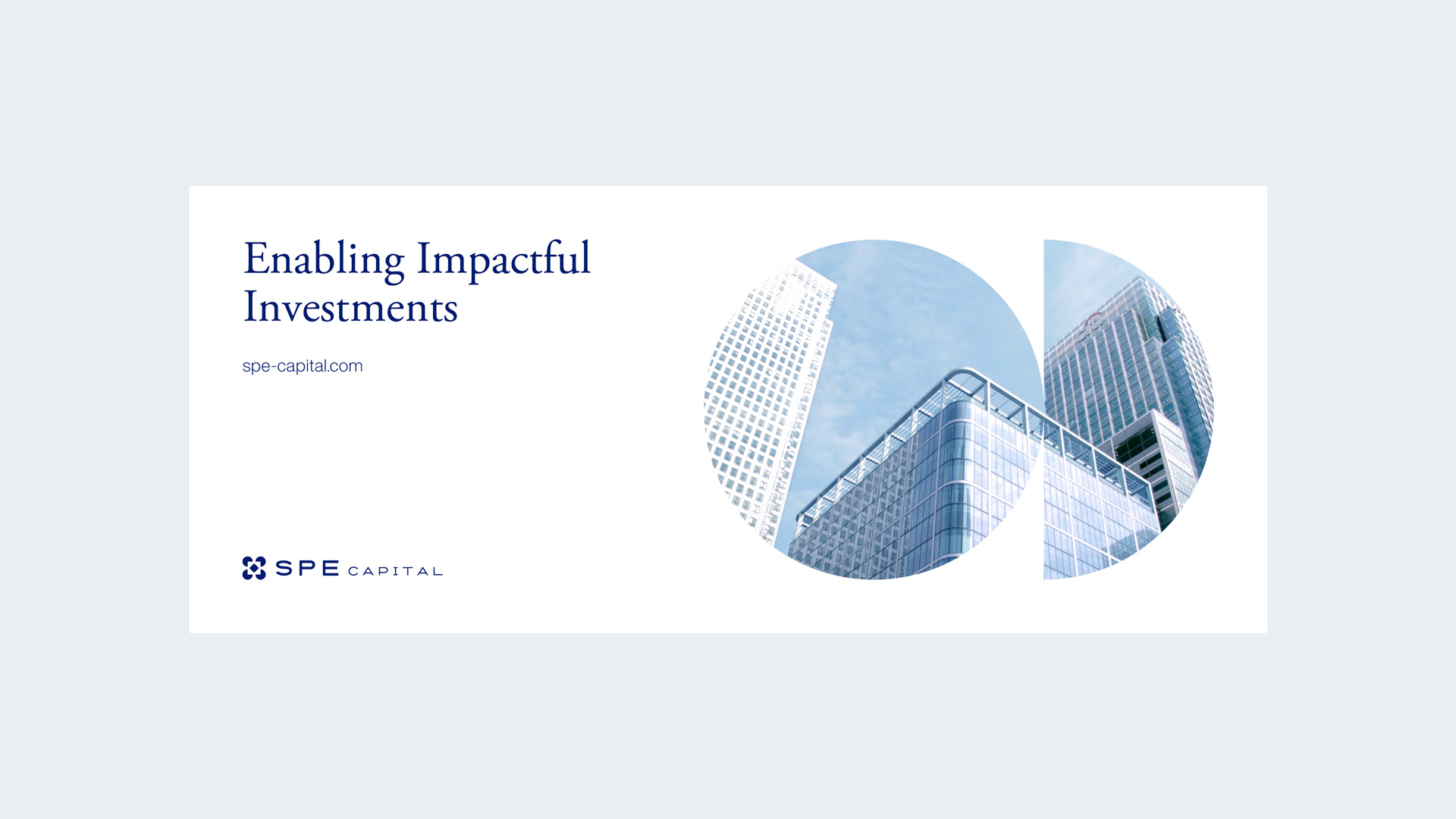
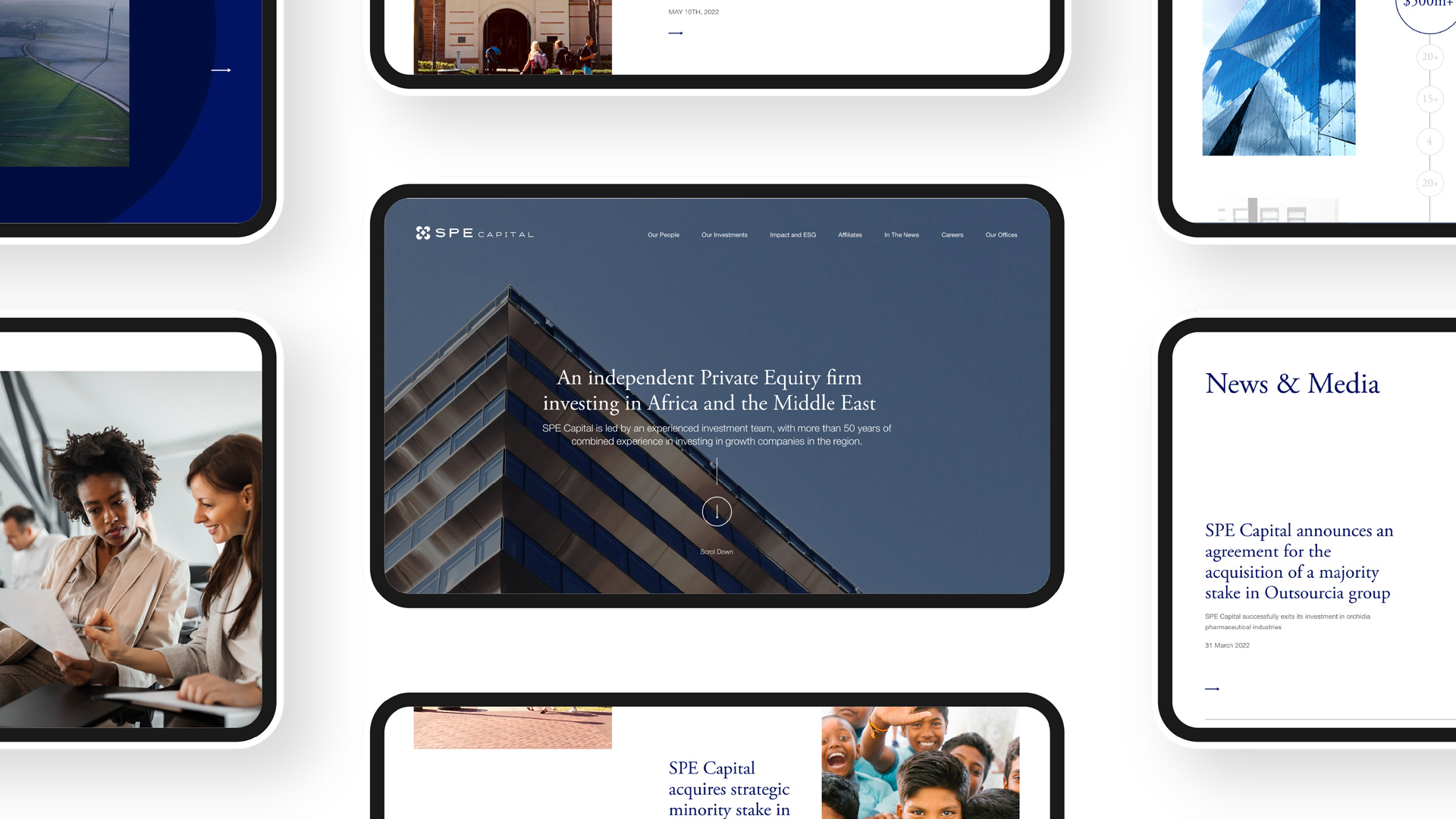
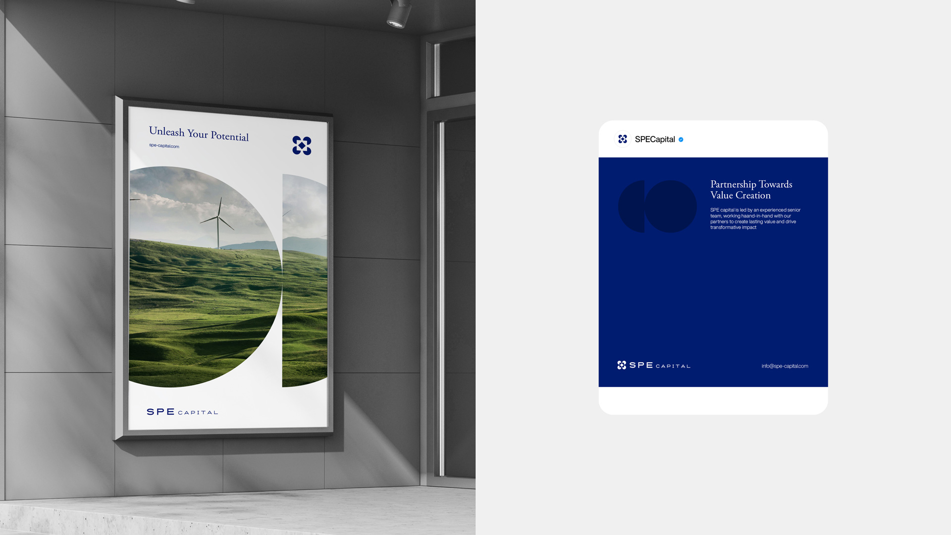
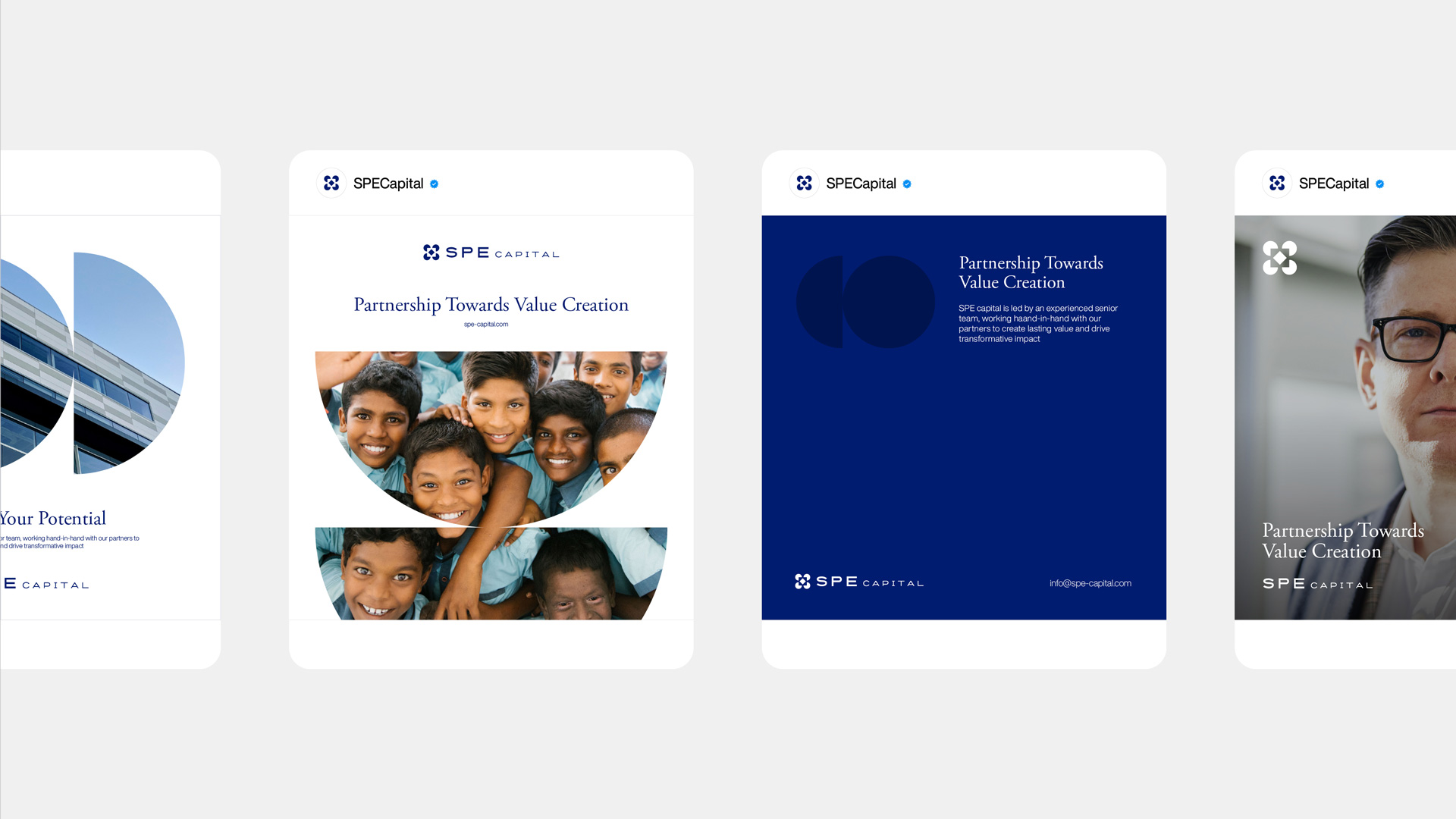
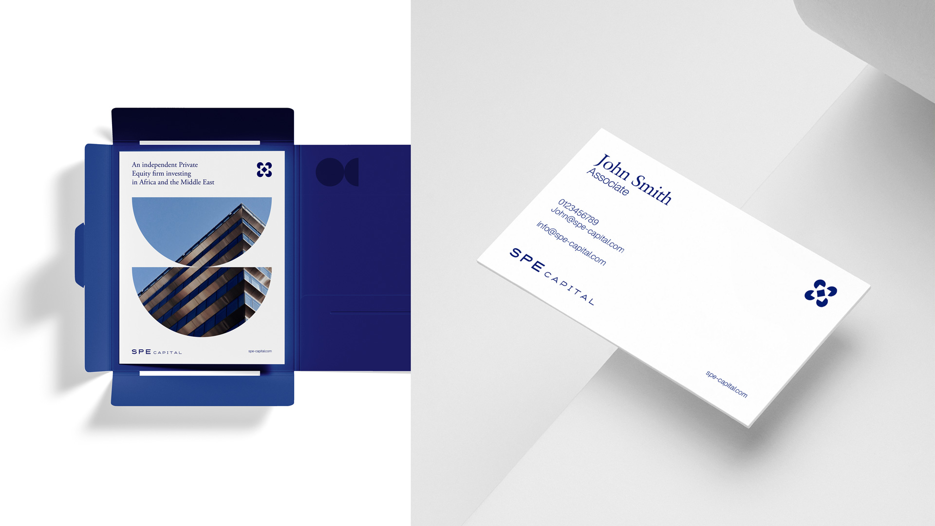
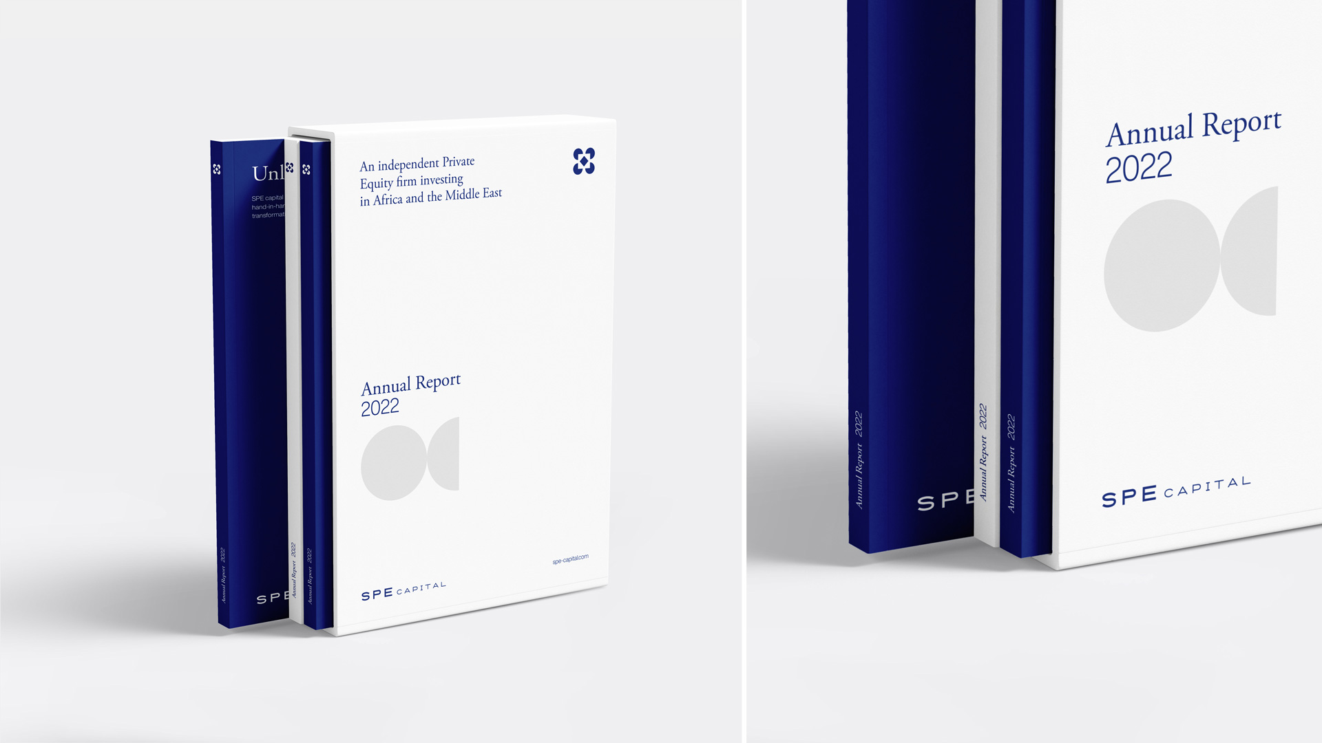
Complementing the logo, we carry the brand’s progressive and collaborative essence throughout the visual language, a language that is felt and seen at every touch point of the brand’s visual identity.


Next Project